Tuesday, November 24, 2009

35% of California Homes with Mortgages Are Underwater

According to a recent report from First American CoreLogic, 35% of California homes with mortgages were underwater as of September, 2009. Results were generally better in the Bay Area, although not in the East Bay.


There's no mystery about why so many homes in the East Bay are underwater. Prices there have fallen further than in the other regions.


Note: I don't have aggregate price indexes for the regions shown in the First American report, so I just showed the component counties.

The number of underwater homeowners continues to grow. (See this map for numbers from November, 2008.) As I mentioned in an earlier posting, the number of foreclosures is likely to continue growing as well.

Nation's Housing Prices Were Flat in September

The Case Shiller home price indexes for September were released today. The 20-city composite index was essentially unchanged from the prior month. Ten of the twenty cities actually fell during September. That represents an unpleasant reversal from the August result, when 17 of the cities rose. There are plenty of reasons to question the recent gains in housing prices. We may already be seeing signs that those gains are not in fact sustainable.

The Bay Area seems to be faring better than the nation as a whole, with September prices rising by 1.3% compared to August. Bay Area home prices are now about 14% higher than they were at their March lows, although they are still almost 40% lower than they were at the peak of the bubble.

Friday, November 20, 2009

National Housing Market Update

Here's an overview of recent stories about the nation's housing market.

Housing starts fell more than 10% in October, hitting a six-month low. Pundits are attributing the unexpected decline to uncertainty about the fate of the first-time homebuyer credit. The decline is troubling because housing starts historically have been a good leading indicator of overall economic activity.

The delinquency rate on residential mortgages hit a record high of almost 10% in the third quarter. That doesn't include the 4.5% of mortgages that are in foreclosure. The combined total of over 14% is also a record, going back to 1972 when the Mortgage Bankers Association initiated its delinquency survey.

The vacancy rate for apartments hit a 23-year high of 7.8% in the third quarter. The vacancy rate is expected to climb further during the fall and winter quarters, when rental demand is seasonally weak.

The unemployment rate rose to 10.2% in October, reaching double digits for the first time in 26 years. The highest rate recorded during the six decades since the government began compiling data was 10.8%, which occurred in 1982.

Despite all the bad news, existing home sales rose 9.4% in September, to a two-year high of 5.6 million units on an annualized basis. The recent strength of demand is at least partially attributable to the first-time homebuyer credit, which is scheduled to expire in the middle of 2010.

Sunday, November 15, 2009

Don't Count on Silicon Valley to Revive Housing Market

Silicon Valley is the economic engine of the Bay Area, but it is not as dominant as many people seem to believe. Take a look at the chart, below, which shows technology sector employment in the Bay Area over the last twenty years.

The numbers in the chart were obtained from California's Employment Development Department. I've defined the technology sector to include computer design and manufacturing, research and development, internet, and software development.

The first thing to notice is that the tech sector is not all that large. There were 250,000 tech jobs in September of 2009. That represents only 15% of the 1.7 million jobs in the San Francisco and San Jose metro areas. And keep in mind that many tech jobs are in supporting roles such as secretarial, accounting, and sales.

The relative size of the tech sector surprised me. What surprised me even more, however, was that the number of tech jobs has never re-approached its dotcom peak. The number of tech jobs in September of 2009 was 33% lower than it was at the peak, and only 10% higher than it was 20 years ago.

The tech sector exerts a significant influence on the Bay Area housing market. Technology employees usually earn high salaries, so they can afford to pay top dollar for homes. But at only 15% of all jobs, the tech sector doesn't dominate the housing market. And judging from the record of the last twenty years, it isn't becoming significantly more important.

Note: Thanks to one of my readers, who pointed out that I had mistakenly compared the number of tech jobs in the San Francisco and San Jose metro areas to the total number of jobs in California. That was an embarrassing mistake. The correct comparison is not as striking as my original, erroneous comparison, but the original conclusion remains valid: The tech sector does not dominate the Bay Area housing market, and does not appear to be headed that way.

Friday, November 13, 2009

Banks Are Still Tightening Mortgage Standards

Mortgage delinquencies have been rising rapidly for the last two years. Not surprisingly, banks have been tightening their standards for new mortgages. Take a look at the chart, below, which shows the net percentage of banks that tightened credit standards for residential mortgages in each quarter.

The chart was derived from the Federal Reserve's quarterly survey of senior loan officers. The survey asks, among other things, if banks tightened or loosened credit standards during the current quarter. The numbers in the chart were calculated by subtracting the percentage of banks that loosened standards from the percentage of banks that tightened standards.

Banks have gone through cycles of loosening and tightening in the past, but the current cycle is unprecedented. Beginning in the fourth quarter of 2006, banks began tightening credit, reaching a peak level of activity in the third quarter of 2008. At that point, roughly 75% of banks were tightening credit standards for mortgages.

In some senses, the panic has receded. In the most recent survey, only 24% of banks said that they were tightening standards. It's important to interpret the chart correctly, however. It does not indicate that credit standards are actually loosening, only that fewer banks are still tightening. (Only 2% of banks actually relaxed their lending standards during the current quarter. That's the first time in a year that any survey respondent has relaxed its standards.)

The continuing clamp-down on mortgage standards probably explains why record-low mortgage interest rates have not had a larger impact on housing prices. It may also provide a clue about when the housing market will recover. The last time that the housing market went from boom to bust, prices didn't bottom out until the mid-1990's, long after banks had begun loosening credit standards.

Friday, November 6, 2009

Mortgage Delinquencies Are Still Rising

The housing market is showing tentative signs of stabilization, but you wouldn't know it from looking at mortgage delinquency data. Nationally, the delinquency rate on residential mortgages is at record levels, and still appears to be rising. Take a look at the chart, below, which shows the percentage of Fannie Mae's single-family home loans that are at least 90 days past due.

The delinquency rate for August of 2009 (i.e., the latest available) was 4.45%. That's almost three times higher than the 1.57% delinquency rate that was recorded in August of 2008, when the financial crisis was already well underway. While it's certainly not scientific, I think it's reasonable to look at the chart and conclude that delinquencies are likely to continue rising for some time.

Note: The Mortgage Bankers Association (MBA) publishes its own National Delinquency Survey. The headline number from the second quarter survey was 9.24%. The MBA figure is heavily skewed by the inclusion of subprime mortgages, which are largely absent from Fannie Mae's portfolio. More importantly, the MBA uses a lower threshold for 'delinquent', requiring only that the borrower has missed a payment.

At first blush, the situation appears to be somewhat better here in the Bay Area. Take a look at the chart, below, which shows the number of default notices recorded in San Francisco as well as the greater Bay Area.

Recorded default notices appear to be stabilizing. There's an important distinction, however, between a default notice and a delinquency. A borrower is said to be delinquent when he falls behind on his loan payments. When he falls far enough behind, the lender may record a Notice of Default, which is the first step in the foreclosure process. Recent changes in California law make the foreclosure process more difficult, so the number of recorded default notices probably understates current delinquency rates.

In other words, it seems likely that delinquency rates here in the Bay Area are still rising, just as they are at the national level.

Monday, November 2, 2009

Impact of Rent Control: $325,000 per Unit

San Francisco has strong rent-control laws. Once you put a tenant in a rent-controlled apartment, you can't raise his rent by more than about 2% per year, and you can't evict him except under special circumstances. Meanwhile, there is never a shortage of people who are looking for a place to live in San Francisco. That combination of laws and circumstances is guaranteed to depress the value of residential property, at least as far as property owners are concerned. But what is the financial impact? Here’s a way to think about it, based on recent sale prices.

The first clue that rent control depresses property values is that vacant apartments are usually worth more than occupied apartments. A vacancy represents an opportunity to replace an outgoing tenant (who typically would have been paying less than market rent) with someone who is willing to pay full price for a home. Take a look at the chart, below, which shows median prices for three-unit buildings sold in San Francisco since 2005.

The median price difference between an empty three-unit building and a full one is $265,000, or approximately $90,000 per unit. Roughly speaking, that’s the value of a one-time opportunity to increase the rent to current market value. (How much of an increase are we talking about? Apartment buildings typically sell for about 14 times gross rent, so $90,000 of extra value equates to about $535 per month of extra rent.)

Unfortunately for property owners, the impact of rent control is much greater than $90,000. Installing a new tenant usually will result in higher rent, but the new tenant will benefit from the same 2% annual limitation on rent increases as the old tenant. For comparison purposes, market rents in San Francisco historically have increased at around 4% per year. At those rates, the new rent will be 10% below market in only five years.

It’s straightforward to calculate the cost (in present value terms) of a 2% annual limitation on rent increases. However, it’s easier (and probably more reliable) to work with current market values. Specifically, since condos are exempt from the most onerous aspects of rent control, we can estimate the impact of rent control by comparing condo prices to apartment prices. Take a look at the chart, below, which shows the median price per unit for occupied apartments, vacant apartments, tenancy-in-common (TIC) units, and condos.

The price difference between a vacant apartment and a condo is $355,000. To be fair, some of the difference in price is attributable to differences in quality. As indicated in the chart, TIC’s typically sell for around $120,000 more than vacant apartments. Since there is very little difference (from a legal point of view) between a TIC and a vacant apartment, we should attribute most of the $120,000 price difference to quality improvements that generally are made when apartments are ‘converted’ to TIC’s.

That still leaves a difference of $235,000 to be accounted for. That’s the typical price difference between a condo and a TIC. The most obvious reason for the price difference is that interest rates on TIC loans are higher (by around two percentage points) than interest rates on condo loans. Ultimately, however, the price difference is attributable to rent control. Why? A TIC owner could reduce his interest rate simply by converting his TIC to a condo. However, the City makes condo conversion difficult, precisely because condos are largely exempt from rent control.

Adding it all up, the impact of rent control comes to roughly $325,000 per unit. That’s for the special case of three-unit buildings, but the impact is likely to be similar for other buildings. I wonder if the creators of rent control had any idea that they would be imposing such a large burden on property owners.

Monday, October 26, 2009

TIC’s Are Still Attractive for Developers

Developers have been buying San Francisco apartment buildings and converting them to tenancy-in-common (TIC) buildings for years. That’s because owner-occupiers are willing to pay more for homes than investors are willing to pay for rent-controlled apartments. Take a look at the chart, below, which shows historical sale prices for TIC’s and multi-unit (apartment) buildings.

TIC prices leveled out at around $500,000 in 2005, and have remained fairly stable since then. Over the same five-year period, multi-unit building prices have hovered in the neighborhood of $250,000 per unit. In other words, TIC’s have been selling for roughly twice as much as apartments. The price premium is easier to see in the chart, below, which shows the per-unit price difference between TIC’s and apartments.

What I find surprising about this chart is that the TIC price premium does not seem to have diminished over time. It dipped modestly in 2008, but has since bounced back to around $250,000 – the same level that it achieved during the peak years of the housing boom.

If I had several hundred thousand dollars in cash and were looking to invest in San Francisco real estate, I’d think about buying an apartment building and converting it to TIC’s. It’s not cheap to remove tenants and renovate a building, but it doesn't cost $250,000 per unit.

Saturday, October 24, 2009

Short Term Rates Likely to Stay Low for Another Two Years

Short-term interest rates are basically at 0%. That’s good news for borrowers with floating-rate loans (which are tied to short-term rates), but how long will it last?

In January, Paul Krugman estimated that short-term rates would remain low through the end of 2011. He based his estimate on historical precedent: The Federal Reserve typically doesn’t start raising rates until two and a half years after recessions end. (At the time, most people were expecting the current recession to run at least another six months.) Now Krugman has made a more careful estimate, based on economic principles rather than historical precedent. His new estimate: The Fed can wait at least another two years to start raising rates, and probably longer than that.

Krugman’s argument is based on two common economic rules of thumb, namely, the Taylor rule and Okun’s Law. His argument is simple, but I thought it would be helpful to explain his rules of thumb.

The Taylor Rule

The Federal Reserve has two distinct mandates, namely, to maintain price stability as well as full employment. The primary tool for achieving these mandates is the federal funds rate. When inflation gets too high, the Fed increases the Fed funds rate in order to slow the economy and dampen inflationary pressures. On the other hand, when unemployment gets too high, the Fed cuts the Fed funds rate in order to stimulate the economy and increase demand for labor. Adjustments to the Fed funds rate are decided by the Fed’s Board of Governors, but a Stanford Professor named John Taylor devised a simple rule that historically has done a good job of mimicking their decisions.

One version of the Taylor rule says that:

Fed Funds Rate = 2.1 + 1.3 x Inflation – 2.0 x Excess Unemployment

Excess unemployment is defined as the difference between the actual unemployment rate and the ‘natural’ rate, i.e., the rate that would prevail if the economy were operating at its potential. Take a look at the chart, below, which plots the Taylor rule formula along with the actual Fed funds rate.

The Taylor rule does a pretty good job of explaining the past behavior of the Federal Reserve. The largest deviation between the rule and the Fed funds rate occurred between 2004 and 2005, when the Fed held short-term rates well below the level suggested by the Taylor rule. (The Fed was criticized at the time – partly on the basis of the Taylor rule – for helping to inflate the housing bubble by keeping rates too low for too long.)

The September unemployment rate was 9.8%. The natural unemployment rate is estimated to be about 4.8%, so excess unemployment is around 5%. Meanwhile, inflation has been running at around 1.6% (and appears to be trending down). If you plug those numbers into the Taylor rule, you get a Fed funds rate of -5.8%. Negative interest rates can’t exist in the real world (people would hold hard currency rather than lend it at negative interest), so the Fed has settled for the next best thing: 0% interest.

As long as the Taylor rule yields a negative result, the Fed will presumably want to keep the Fed funds rate at 0%. So when will the Taylor rule yield a positive result?

Krugman argues that inflation is unlikely to increase during the next couple of years. (Given the amount of idle capacity in the economy, it will be some time before competition for resources puts upward pressure on prices.) Assuming that he’s correct, unemployment must fall to around 7% in order for the Taylor rule to yield a positive result. How long will that take? That’s where Okun’s Law comes in.

Okun’s Law

Increases in population and improvements in technology drive long-term increases in economic output. Over shorter time periods, changes in output are also influenced by changes in the intensity with which resources are used. In particular, if there is a surge in the percentage of the population that is working, there will be a surge in output as well. Or to put it in more familiar terms, GDP generally rises faster than trend when the unemployment rate is falling. It turns out that this relationship can be readily quantified, in the form of Okun’s Law.

Take a look at the chart, below, which plots changes in unemployment against changes in GDP over the last 40 years.

Each data point represents a calendar year between 1969 and 2008. If you fit a line to the data, you get the following equation:

Change in Unemployment = - 0.4 x ( Change in GDP – 3% )

As an example, if GDP rises by 4%, unemployment should fall by 0.4%. (Incidentally, the equation also says that if GDP rises by 3%, unemployment shouldn’t change. In other words, the equation implies that 3% is the trend rate of GDP growth.)

With the economy coming out of recession, GDP is likely to grow faster than trend for the next few years. How much faster? Krugman suggests that 5% is a safe upper bound for GDP growth. (I agree. Full-year GDP growth has exceeded 5% only once in the last 30 years. Most economists expect the current recovery to be slower than normal.) With 5% GDP growth, Okun’s Law says that the unemployment rate will fall by 0.8% per year. With unemployment currently at 9.8%, it will be another three and a half years before the recovery pushes unemployment down to the 7% threshold which would justify a positive Fed funds rate.

Note: Krugman’s two-year estimate was based on a more conservative set of assumptions. I assume that his conservatism was intentional. In any event, my goal is to help explain his reasoning, not to quibble with his numbers.

What does this mean for homeowners? Most floating rate loans are tied to LIBOR, which is driven by the Fed funds rate. Krugman’s argument suggests that borrowers with floating rate loans can breathe easy for at least another two years, and probably a good deal longer than that.

Monday, September 28, 2009

Residential Sales Down 55% Since Bubble Burst

People are always asking me, "How's the market?" Here's the simplest answer I know. Take a look at the chart, below, which shows the annual value of residential sales in San Francisco over the last fifteen years.

Sale prices didn't peak until the spring of 2007, but sale volumes started falling in 2004 (see this earlier blog entry). Stated in that way, the historical trajectory of the market may be difficult to grasp. The story becomes simpler, however, when prices and volumes are combined: After peaking at $8.0 billion in 2005, residential sales have fallen in every year since. Through the first eight months of 2009, sales are running at an annualized rate of only $3.6 billion. In percentage terms, that amounts to a 55% decline since the housing bubble burst.

That's how the market is doing.

Sunday, September 27, 2009

Job Seekers Outnumber Openings Six to One

Today's New York Times has a discouraging story about the job market. According to the Labor Department, there are 14.5 million people officially unemployed, but only 2.4 million full-time permanent jobs open. That means that job seekers outnumber openings by a ratio of six to one. By comparison, the jobs-to-openings ratio never even reached three-to-one following the dotcom bust. (Unfortunately, the Labor Department didn't start tracking job openings until 2000, so we don't know what the ratio might have looked like during previous recessions.)

As icing on the cake, the story adds that many companies have pared back working hours for their remaining employees. When demand begins increasing once again, they'll be able to expand output without creating any new jobs.

Stories of idle capacity at American companies are rife. Take a look at the chart, below, which shows manufacturing capacity utilization over the last 60 years.

Capacity utilization is running at a 60-year low of 65.8%. That's 15 percentage points below the historical average of 80.9%. Manufacturing represents only about 12% of GDP, but considering the many other examples of idle capacity, I'd say that the Times story is right. It's likely to be quite awhile before unemployment falls appreciably.

Thursday, September 24, 2009

Home Prices and Land Values

At the risk of stating the obvious, San Francisco housing is expensive because San Francisco land is expensive. Take a look at the chart, below, which shows historical sale prices for single family homes and vacant residential lots in four of San Francisco's ten real estate districts.

The blue bars show average sale prices for residential lots ranging from 1,500 to 4,500 square feet. (I used the average instead of the median because the average seemed to give a truer picture of what was happening to 'typical' lot values.) The dashed purple line shows median sale prices for single family homes. The four districts represented in the chart accounted for 86% of San Francisco's residential lot sales over the last fifteen years (i.e., as far back as my data goes).

Evidently, lot prices are correlated with home prices. That's what you would expect. Construction costs don't change much from year to year, so the opportunity to build a new home becomes more valuable as home prices rise. That causes developers to bid up the price of buildable lots. (Conversely, the high price of buildable lots prevents would-be homeowners from avoiding high home prices simply by buying vacant land and building their own houses.)

Through the first eight months of 2009, the average residential lot price was $440,000, compared to a median home price of $600,000. In other words, 73% of the value of a typical home (in one of the four districts listed above) is attributable to the underlying land. At the peak of the housing market, land accounted for almost 80% of the value of a typical home.

The price difference between a home and a comparable vacant lot can be interpreted as the market value of the existing structure (i.e., the thing that we usually refer to as a 'house'). Take a look at the chart, below, which plots the difference between the median home price and the average residential lot price for the same four districts as before.

The series is volatile, but averages out to around $175,000 over the fifteen-year period represented in the chart. That's the value that the market is implicitly assigning to existing single-family structures.

$175,000 doesn’t go very far in San Francisco. Even the small, 1,250 square-foot houses that typically are found in these districts would cost more than that to rebuild. Why does the market seem to value them at less than replacement cost?

The answer is that they would not be replaced today. If it costs $300 per square foot to build a house that will sell for $600 per square foot, it’s clearly more profitable to build a big house than a small house. That’s exactly what developers have been doing. In the process, they’ve driven lot prices up to the point where building a small, old-fashioned house would be a money-losing proposition.

So how valuable is San Francisco land? It’s so valuable that you probably wouldn’t even consider rebuilding your current house if it burned down. You’d be destroying a great deal of value if you did.

Sunday, September 6, 2009

Commercial Real Estate Is Experiencing Its Own Hangover

The housing market wasn’t the only sector of the economy to experience a bubble earlier this decade. The commercial real estate market went through a bubble of its own. Take a look at the chart, below, which shows the NAREIT price index for equity REIT’s.

A REIT is basically a real estate holding company. Provided that it distributes at least 90% of its earnings in the form of dividends, it is exempt from corporate income tax. The NAREIT index is an index of REIT prices, similar to the S&P 500 stock index.

REITs typically finance their investments with a mixture of debt and equity. Their share prices measure the market value of their equity, so they are imperfect proxies for the value of their underlying real estate holdings. On the other hand, because the shares are actively traded on public exchanges, the quoted prices provide a current snapshot of what’s going on in the commercial real estate market. (In contrast, popular housing market indicators such as the Case Shiller indexes are published only once a month, with a two-month lag.)

REIT prices rose by more than 100% over a four-year period beginning in 2003. Following the peak in early 2007, prices fell steadily for the next two years. During that period, REIT earnings actually increased at a healthy rate. Prices fell because investors were concerned that future earnings might be lower. In the fall of 2008, they were proved right in a spectacular way. Over the course of just nine months, earnings (and prices) fell by almost 50%. Take a look at the chart, below, which shows an index of dividends for the NAREIT index.

Dividends didn’t peak until mid-2008. Since then, they have fallen by 46%, and are now at their lowest level in more than 20 years. Remember, REITs are required to distribute at least 90% of their earnings in the form of dividends. So the decline in dividends will have been closely paralleled by a decline in earnings.

The dramatic fall in earnings suggests that REITs will have increasing difficulty servicing their debts. Here in the Bay Area, for instance, the delinquency rate on commercial mortgages rose from 1% in the second quarter of 2008 to 4% in the second quarter of this year. Nationally, the default rate on commercial mortgages rose from 1.2% in the second quarter of 2008 to 2.9% in the second quarter of this year. Forecasters are calling for a continued rise in the default rate, to around 4% by year’s end.

Even if REITs successfully meets their debt service requirements, they may still face serious financial problems as a result of declining earnings. Unlike residential mortgages, commercial mortgages typically have brief terms of only 5-10 years. When a commercial mortgage is due, it must be paid off in its entirety. The common solution is to obtain a new mortgage and use the proceeds to pay off the old one. If the value of the property has fallen, however, banks may refuse to lend as much as the borrower needs to pay off the old mortgage. In that event, the borrower may face foreclosure, even if he hasn’t missed a mortgage payment.

That’s the situation that owners of commercial real estate are facing now. I don’t have hard any numbers, but the press if full of stories about borrowers in good standing who aren’t able to rollover the mortgages on their buildings. (In this respect, REITs are actually better off than most other owners of commercial real estate, since they generally use less leverage.) The result is likely to be an increased level of forced sales, which will put additional downward pressure on property values.

The NAREIT index touched bottom in February, and has risen 44% since then. As with the housing market, however, the recent bounce is primarily attributable to a collective sense of relief that the world isn’t descending into a second great depression. After all, REIT earnings are still falling rapidly, and the credit crunch hasn’t shown many signs of easing. Commercial real estate values are likely to be under pressure for some time to come.

Monday, August 31, 2009

Haircuts and Consumer Spending

Last week, I used haircuts as an example in a posting about consumer spending cutbacks. It turns out that consumers really are trying to save money by getting fewer haircuts. According to today's Wall Street Journal, roughly 70% of salons have seen a dropoff in revenue, while sales of hair clippers have risen by 10%. The next time that the Federal Reserve decides to pump up the economy by buying bonds, maybe they should pay with haircut vouchers instead of cash.

Wednesday, August 26, 2009

Bay Area Home Prices Up Again

Case Shiller released their home price indexes for June on Tuesday. Prices rose in 18 of the 20 markets that they cover. The Bay Area was one of the strongest markets, with prices rising by 3.8% compared to the prior month.

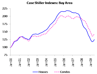
Case Shiller publishes its indexes with a two-month lag. If you don't want to wait that long, Dataquick provides median sale prices, which they publish with only a one-month lag. They released their results for July even before Case Shiller had released their results for June. And while Case Shiller publishes only two indexes for entire the Bay Area, Dataquick publishes a median sale price for every zip code.

Median sale price is a poor way to measure price movements for a diverse market like the Bay Area. It is sensitive, not only to price movements, but to changes in the mix of homes as well. July's results are a case in point. The best-performing county in the Bay Area was Santa Clara, where the median sale price rose by 10% compared to June. Yet the median sale price for the entire Bay Area rose by 12%. The explanation for this odd result is that sales volumes fell in some of the less expensive counties, and rose in some of the more expensive counties. The Case Shiller indexes were specifically designed to eliminate this problem.

Having said that, I'm usually too impatient to wait an extra month for the Case Shiller numbers. I'm mainly interested in county-level numbers anyway. Here's a chart of median sale prices for San Francisco County.

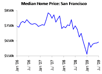
If you put any stock in median sale prices, the San Francisco market bottomed out in January, and has risen 14% since then.

By the way, the commonly quoted Case Shiller indexes are for single family homes only. Focusing on that statistic can cause its own problems if you're interested in a market like San Francisco, where condos comprise such a large fraction of the housing stock.

Tuesday, August 25, 2009

Job Market May Be Stabilizing

The job market is showing signs of stabilization. After hitting a 25-year high of 9.5% in June, the national unemployment rate fell back to 9.4% in July . Bay Area unemployment rose by less than 0.1% in July, finishing the month at 10.8%.

Most economists are expecting a slow, multi-year recovery in the job market. It would be nice to think that we've finally begun that recovery. If so, then Bay Area home prices may finally have hit bottom.

Saturday, August 22, 2009

Buffett is Wrong about Government Borrowing

Warren Buffett wrote an article for Tuesday’s New York Times, in which he speculated about how the federal government is going to finance its huge deficit. His conclusion? Private sector sources won’t provide enough money to finance the deficit, so the Federal Reserve will have to step in and print money. I never thought I’d see the day, but Buffett is way off base here.

Here’s a summary of Buffett’s analysis: The federal deficit is projected to hit $1.8 trillion this year. Buffett estimates that around $400 billion of that will come from foreigners, and that another $500 billion will be made available through the saving activities of American citizens. That leaves a shortfall of at least $900 billion, which Buffett claims must be provided by the Federal Reserve in the form of freshly printed money.

This analysis is wrong on several levels. For starters, it appears that Buffett considered only one source of domestic savings, namely households, and neglected saving activities undertaken by businesses. More importantly, he ignored private investment, which draws from the same savings pool as federal borrowing. Buffett actually alluded to this fact in his article, but suggested that if private investment were factored into the analysis, it would make the savings shortfall even worse. On the contrary, the problem largely disappears when private investment is included.

The discussion will be more illuminating if we focus on changes in saving and investment, rather than absolute levels. I’ll use 2007 as a base year (the recession didn’t start until December of that year), and discuss changes between then and the first quarter of 2009 (i.e., the latest quarter for which I have data). Take a look at the table, below, which shows Buffett’s numbers for the two periods.

These figures come from the Saving and Investment table of the National Income and Product Accounts, provided by the Bureau of Economic Analysis. The Q1 2009 figures are annualized. They are different from Buffett’s more recent estimates, but the differences won’t affect my conclusions.

Household savings have increased significantly since 2007, but the increase was more than offset by a reduction in savings provided by foreigners. Meanwhile, the federal deficit increased by more than $900 billion. According to Buffett’s logic, this implies a savings shortfall of roughly $1 trillion, which the Federal Reserve must have covered by printing money.

The first problem with this analysis is that it neglects business savings. That’s an important oversight, because businesses actually save more money than households. The second problem is that Buffett’s calculation ignores private investment, which must be subtracted from private savings in order to determine how much money is leftover to finance the deficit. Take a look at the table, below, which shows gross business saving and gross private investment.

These figures were obtained from the same NIPA table as before. Gross private investment includes residential construction, which is primarily a household investment, not a business investment. Unfortunately, the NIPA tables don’t provide separate estimates for household and business investment. We’re mainly interested in the consolidated figure anyway.

There has been a huge decline in private investment. The causes are easy to identify. Residential construction has been falling for several years, following the bursting of the housing bubble. Business investment remained strong until the financial crisis began, but has fallen steeply since then, as the outlook for profits has dimmed. The result has been a $703 billion contraction in private investment spending. Throw in a $60 billion increase in business saving, and we’ve covered 75% of the savings shortfall identified in the first table above.

This is not a numerical coincidence. The economic definitions of ‘saving’ and ‘investment’ imply that the two are always equal when aggregated at the national level. I neglected several smaller entries in the NIPA table (such as borrowing by state and local governments), otherwise we would have found that the total savings shortfall was zero (within statistical bounds). In other words, there is no mystery about how the government is going to finance its additional deficit this year. The extra savings will mainly come from domestic households and businesses, both of which are scaling back expenditures and paying down debt in response to the recession.

There’s a deeper lesson to be found here. Buffett wonders where the additional savings will come from to finance the government’s extraordinary deficits. The question itself indicates a lack of understanding about how the economy works. The right question is, how much money does the government need to spend in order to soak up the extraordinary amount of savings that the private sector is currently generating?

There is no way for the public collectively to create a savings account of unused haircuts. If everyone decides to scale back on haircuts, barbers simply make less money. The same observation applies to the rest of the economy. We can’t collectively ‘save’ output (except by running a current account surplus, which doesn’t appear to be in our immediate future). If everyone decides to spend less money, the end result is that everyone works less. That’s the definition of a recession.

The budget deficit didn’t just happen to come along at the same time as households and businesses were ramping up their savings. The government is ramping up spending in order to offset private sector spending cutbacks, which are the root-cause of the recession. The government needs to run higher deficits only so long as the private sector insists on spending (or investing) less than it earns.

In other words, Buffett has it backwards: The government doesn’t need the private sector to save heavily in order to finance extraordinary deficits. The private sector needs the government to spend heavily if it wants to save extraordinary amounts of money.

Thursday, August 20, 2009

No Money to Build "The New American Home"

Today's Wall Street Journal has an amusing story that exemplifies the state of the Nation's housing market. Every year at its convention, the National Association of Home Builders features "The New American Home," a high-end model home that showcases the latest innovations in building technology. According a recent appraisal, this year's New American Home will be worth $3.5 million when it's finished. The developer has already spent $800,000 of its own money on construction, and needs another $1.7 million to complete the project. Unfortunately, it hasn't been able to get a loan. At least six banks have declined to fund the project. I'm sure that the New American Home is intended to be inspiring, but at this point it's in danger of becoming a high-profile embarrassment.

Wednesday, August 19, 2009

Encouraging News from the Mortgage Market

The Federal Reserve just released the results of its second quarter survey of senior loan officers. The Fed uses the survey to assess the supply of, and demand for, loans to businesses and households.

During the second quarter of 2009, domestic banks continued to tighten lending standards for prime residential real estate loans. That continues a trend that's been going on for the past three years. The good news is that for the second consecutive quarter, banks reported increased demand from prime borrowers for residential mortgages. The increase in demand is probably indicative of the passing of the financial crisis, rather than the beginning of a sustainable trend. Nonetheless, it's another sign that the housing market may finally be stabilizing.

Tuesday, August 18, 2009

Mixed Results for Residential Construction

Recent reports are showing mixed results for residential construction. The Commerce Department said today that July housing starts were down 1% compared to June. That was a disappointing result after June's 4% rise. Single family home starts were up 1.7%, but again, that was well below the 14% increase recorded in June. Whether you focus on all housing types or single family homes, July's results don't show any significant improvement compared to June.

Yesterday, the National Association of Home Builders released the August edition of its Housing Market Index. The HMI rose by one point compared to July, and now stands at 18. That's the best result since June, 2008, but it's well below anything that could be considered 'normal'. The average level of the HMI over it's 24-year history is 52. Until the current crisis began, it had fallen below 25 only once, for a two-month period during the 1990-91 recession.

The HMI is a confidence index, based on surveys of residential builders. August's result indicates that the outlook among builders is improving, but remains subdued. That's consistent with what most economists are saying about the broad economy.

By the way, it's curious that the 'buyer traffic' component of the HMI came in at 16, while the 'expectations' component came in at 30. If buyer traffic is so light, why are builders expecting the market for new homes to improve anytime soon?

Wednesday, August 5, 2009

Housing Market Recovery May Take Years

There seems to be a widely held assumption that home prices will bounce back quickly. That's silly. The housing market just went through a bubble, meaning that prices reached unsustainably high levels. So why should prices return to those same levels anytime soon?

Setting aside this logical inconsistency (or is it denial?), there is plenty of precedent for long declines in home prices. Take a look at the chart, below, which shows the Case Shiller home price index for Los Angeles.

Los Angeles prices peaked in 1990, and then fell for the next six years. The peak-to-trough decline was roughly 25%. Prices didn't return to their 1990 levels until 2000

Of course, this doesn't mean that we should expect the same course of events for Bay Area home prices. For starters, prices here have already fallen more than 25%. But it does highlight the fact that home prices tend to move in lengthy cycles. We shouldn't assume that they'll quickly adjust to the latest economic news, whether good or bad. And remember, most economists are expecting a long, grinding recovery from the current recession. Why should the housing market do any better?

Thursday, July 30, 2009

Housing Market May Be Stabilizing

I can't decide if I'm skeptical or cautiously optimistic. But recent results suggest that the Nation's housing market may be stabilizing. Here's a summary:

1. Housing starts for June were up 4% (on a seasonally adjusted basis) compared to May. That's for all housing types; for single family homes, the one-month increase was 14%.

Housing starts have risen in each of the last two months. The data series are clearly volatile, however, so it's too early to announce a recovery. And if housing starts have in fact begun to recover, they’re starting from a very low level. The annualized rate of starts for June was 582,000 units. Before the crisis began, the rate had fallen below 800,000 units only once in the 45-year history of the data series.

Note: In an earlier blog entry, I mentioned that housing starts historically have been an important driver of overall economic activity. So stabilization in this sector would be encouraging news for the broader economy.

2. Sales of new single family homes for June were up 11% (on a seasonally adjusted basis) compared to May. That's the largest percentage increase in the last eight years. Sales have risen in each of the last three months, and are now 16% above their March lows.

Again, some historical perspective seems important here. The seasonally adjusted annual rate of sales for March was 332,000 units – a record low. The June rate of 384,000 units was nothing to shout about either. Before the crisis began, sales hadn’t been that slow since the 1981-82 recession.

Because sales are at such depressed levels, percentage increases can be misleading. June’s 11% improvement was an eight-year record for percentage increases, but the absolute increase in sales was a modest 38,000 units (on an annualized basis). Over the six-year period represented in the chart above, there were 14 months where sales increased by more than that.

3. Existing home prices for May were up 0.5% compared to April. That’s hardly worth mentioning on its own, but it’s the first increase in almost three years, following a cumulative decline of 32% from the peak.

The bigger news is that prices rose in 14 of the 20 markets represented by the Case Shiller indices. So May’s first hint of price stabilization is broad-based, and not simply the result of large increases in a few markets.

4. Existing home sales for June were up 3.6% (on a seasonally adjusted basis) compared to May. Monthly sales of existing homes have now increased for three months in a row.


The volatility of this series should encourage caution when extrapolating the last few months worth of data. Keep in mind, too, that until May, prices of existing homes had fallen for 32 months in a row. So while sales volumes may have stabilized, the stability has been fostered by continuous price reductions. It will be difficult to argue that the market for existing homes has stabilized until prices stabilize as well.

On the whole, it seems a little early to announce an end to the housing market downturn. Housing starts and new home sales may well have stabilized. But the tenuous stability in the market for existing homes has been paid for by continuous price reductions. There’s a good chance that demand is still falling in that segment of the market. We’ll want to see at least a few months of broad-based price stability before proclaiming that the housing market has finally bottomed.

Wednesday, July 22, 2009

Architecture Billings Index Falls Again

After recovering from record lows earlier in the year, the Achitecture Billings Index fell significantly in June. That's another indication that economic recovery may still be a ways off.

Source: American Institute of Architects (AIA), via Calculated Risk.

Tuesday, July 21, 2009

No Sign of Economic Recovery

In a recent posting, I said that the financial panic has subsided, but that the housing market is unlikely to recover soon. Paul Krugman made a similar point last week, about the broader economy. I won't reproduce his comments here, but I will borrow his chart (which he borrowed from Goldman Sachs, in any case).

Together, the four series included in the chart represent a sizable portion of overall economic activity. They all fell significantly during 2008, and they've all been flat since the beginning of 2009. Economic activity remains at depressed levels, with few signs of improvement.

Monday, July 20, 2009

San Francisco Housing Market Recovering Strongly - For How Long?

The San Francisco housing market has strengthened significantly since the beginning of the year. Prices are still 10% to 15% lower than they were last summer, but that represents a marked improvement from January, when they were down by roughly 25%. Take a look at the chart, below, which shows the recent history of home prices in the City.

The solid blue line shows median sale prices for 2-4 bedroom single family homes in San Francisco. The dashed purple line shows median sale prices for 1-3 bedroom condos. I smoothed both series slightly, using a trailing two-month average.

In January, San Francisco home prices were roughly 25% lower than they had been just six months earlier. And they were on a trajectory that seemed to imply disaster. Since then, the economy appears to have stabilized. The recession isn't over yet, but the panic has subsided. Not surprisingly, home prices have bounced back somewhat, rising by about 10% since January.

Is the recent price trajectory sustainable? I'll save that for a future blog entry. Meanwhile, the chart below seems worth considering.

The solid blue line shows median sale prices for 2-4 bedroom single family homes in San Francisco. The dashed purple line shows the S&P 500 stock price index.

It seems clear that over the last couple of years, the housing market and the stock market both have been driven by the same underlying factors. That's hardly surprising, given the dramatic events of the last 18 months. The recent close correlation is unusual, however. Over longer time horizons, houses and stocks generally don't track each other very closely. Stock prices respond rapidly to economic news, limited only by investors' imaginations. In contrast, home prices are sharply constrained by the ability of consumers to pay for them. So while expectations of improvement in corporate profits may drive stock prices higher, continuing deterioration in the job market is likely to put a ceiling on home prices.

Note: You can find additional price charts for San Francisco and the Bay Area in the Market Stats section of my website.

Sunday, June 28, 2009

The Panic Is Over but Don't Expect Quick Recovery in Housing

The World panicked when Lehman Brothers collapsed. Credit markets froze and stock markets nosedived as investors fretted about the risk of a second Great Depression. Inevitably, the housing market got caught up in the crisis of confidence. Starting from already low levels, most indicators of housing activity fell to record lows in the opening months of 2009.

Several months later, it appears that disaster has been averted. The direst indicators of distress have returned to levels that are merely concerning, and not terrifying. It shouldn’t come as a surprise, therefore, that housing market indicators have bounced back from recent lows. But stepping back from the brink of disaster isn’t the same thing as recovery. The housing market downturn was well underway before the panic started, and may still have some ways to go now that the panic is over.

Consider the following series of charts, which illustrate the spike in panic levels. The first chart, below, shows the so-called TED spread.

The TED spread is the difference between the interest rates on 3-month interbank loans and 3-month Treasury bills. The former is the interest rate that (non-US) banks pay when they borrow from each other; it’s commonly known as LIBOR. The difference between LIBOR and the Treasury rate is an indicator of the perceived riskiness of lending money to commercial banks.

By September of 2008, the TED spread had already widened significantly from pre-crisis levels. When Lehman Brothers collapsed, however, the spread spiked to more than ten times its pre-crisis levels. Evidently, major banks suddenly became concerned that if Lehman could fail, so could any other major bank. Indeed, almost every bank in the country has since received federal bailout money to keep it afloat.

The TED spread has fallen steadily over the last several months. It’s still at elevated levels – suggesting that banks aren’t out of the woods yet – but the worst of the crisis has subsided. Some of the larger banks have actually begun returning their bailout money.

The stock market also went into a panic in September. Take a look at the chart, below, which shows the VIX volatility index.

Volatility is a measure of stock price fluctuations. High volatility indicates that stock prices are changing rapidly. When Lehman Brothers collapsed, the VIX index went from around 20 to a record of over 60. The index has declined significantly since then, to its current level of around 25. That’s still higher than the levels that prevailed immediately before the crisis, but it’s not much higher than the long-run average of around 19.

It’s instructive to make a quick detour into option theory. Options can be thought of as insurance against big stock price movements. When volatility rises, the insurance gets more expensive. What the VIX index actually measures is not current volatility, but the volatility that’s implied by option prices. In other words, the VIX index is essentially measuring the cost of insuring against big stock price movements. Immediately before the crisis, insurance was much cheaper than it had been historically, suggesting that investors may have been overly complacent about risk. When the crisis was in full swing, the cost of insurance hit record levels.

The bond market provided what was perhaps the most alarming indicator of panic. Take a look at the chart, below, which shows the difference between the yields on ordinary 10-year Treasury notes and 10-year inflation-indexed Treasurys.

When investors lend money to the Government, they usually demand a certain base rate of return (the so-called ‘real return’) and then add something extra to compensate for expected inflation. For instance, if investors normally require a 3% real return, they’ll demand a yield of 5% on Treasury notes if they’re expecting an inflation rate of 2%. That’s because inflation will erode the purchasing power of their loan principal by 2% per year. The extra 2% interest is compensation for the 2% annual erosion of the purchasing power of their principal.

Inflation-indexed Treasurys are designed to compensate investors directly for the eroding effect of inflation. If inflation runs at 2%, the Government automatically increases the loan principal at the same rate of 2%. Since the purchasing power of the loan principal is protected from inflation, the regular interest payments don’t need to include any extra compensation. The yield on inflation-indexed Treasurys can therefore be taken as a direct measure of the real return that investors require on loans to the Government.

The difference between the yields on ordinary 10-year Treasury notes and 10-year inflation-indexed Treasurys provides an indication of the inflation rate that’s expected to prevail over the next ten years. Before the crisis began, expected inflation was running at around 2.5%. That was in line with the historical average for (expected) inflation. It was also consistent with the 2%-3% inflation range that the Federal Reserve seems to have targeted in the past.

When the crisis began, expected inflation fell essentially to zero, reflecting investor concerns that the US might experience a ‘lost decade’ similar to what Japan went through in the 1990’s. As with the TED spread and the VIX index, however, inflation expectations have reverted toward normal levels lately, and are now only somewhat lower than they were before the crisis. Presumably, investors are no longer concerned about the possibility of a protracted recession (although many economists believe that there is still a substantial risk that the US will experience a lost decade).

What does all of this have to do with housing? Much has been made of the recent upturn in housing market activity. Housing starts have increased for several months in a row, as have sales and even, in some markets, prices. Take a look at the chart, below, which shows the Housing Market Index, published by the National Association of Home Builders.

The Housing Market Index (HMI) is a measure of builder confidence. It’s a good proxy for residential construction activity.

The HMI index fell significantly when Lehman Brothers collapsed. From a level of 17 in September, it fell to a record low of 8 in January. Unlike the other distress indicators above, however, the HMI index had begun deteriorating long before the panic began. It bounced back to 15 in the latest survey, but the bounce is mainly attributable to the end of widespread panic, not a general recovery in the housing market. The index is still far below the neutral level of 50, which would indicate an even balance of optimism and pessimism among builders.

Bay Area home prices have risen from their recent lows. Is that an indication that demand is finally turning around, or is it a one-time bounce, resulting from the end of the panic? My money is on the latter hypothesis. Considering the severity of the panic, it would be surprising if home prices didn’t bounce back when the panic subsided. The recession is still in full swing, however, and jobs are still being lost at a rapid pace. (Unemployment rose by 0.5% in May alone.) People who are banking on a continuing recovery in home prices are likely to be disappointed.

Wednesday, June 24, 2009

KPIX Story about Multiple Offers - Tying Up Loose Ends

KPIX ran a story in March about a house that received 42 offers. I said at the time that the house was severely underpriced. Out of curiosity, I decided to see what happened to it.

The house in question was 555 Edinburg. It was listed at $459,000, which is equivalent to $367 per square foot. By way of comparison, the median price-per-square-foot multiple for the 16 comparable houses that I identified was $451. In other words, the house on Edinburg was priced at a large discount relative to the comps, so it should have received multiple offers.

The sale closed on April 22nd, at a price of $570,000. That's equivalent to $456 per square foot -- right in line with the comps. Take a look at the chart, below, which shows the distribution of price-per-square-foot multiples for the comps.

555 Edinburg landed almost precisely in the middle of the distribution. Keep in mind that the comps were sold over a five-month period between October, 2008 and February, 2009. Those were the darkest months of the financial panic that ensued following the collapse of Lehman Brothers. In other words, far from signaling a recovery in the San Francisco housing market, the sale of 555 Edinburg signaled continuing softness.

The good news, if there is any, is that the market clearly did its job. Despite what was no doubt a bidding frenzy, 555 Edinburg sold right where it should have.

Thursday, June 18, 2009

Falling Prices and Rising Sales

In an earlier posting , I said that sharp price reductions have had much to do with the rising volume of home sales in the Bay Area. I should have included this chart with the earlier posting.

Each dot represents one of the nine Bay Area counties. The horizontal axis shows the year-on-year change in the median home price. The vertical axis shows the year-on-year change in the volume of sales. The dashed line is a least-squares fit of the data points.

The theoretical value of the line is dubious, but it does help to illustrate my point. The line intersects the horizontal axis at a value of -30%. That's how far prices had to fall in a typical Bay Area county in order to keep sales at the same level as a year ago. In counties where prices fell further, sales volumes have increased significantly compared to last year's levels. But that clearly shouldn't be taken as an indication of health in the housing market.

San Francisco Apartment Rents Falling Rapidly

Near-term fluctuations in apartment rents have little impact on long-term housing values. But they do offer a useful window into the health of the local economy. The view from that window doesn't look good right now. Take a look at the chart, below, which comes from SFRentStats.

The data comes from Craigslist, and covers the City of San Francisco.

Rents have fallen by about 20% since the spring of 2008. That doesn't mean that the sky is falling. Even after the decline, rents are no lower than they were two years ago, when the economy was generally thought to be on solid footing. As long as rents are falling, however, it will be difficult to argue that the San Francisco economy has turned the corner.

Monday, June 8, 2009

Price Declines Likely to Push Foreclosure Rates Higher

Why do homeowners default on their mortgages? Researchers generally focus on two main reasons: job losses and price declines. Job losses directly impact default activity, because they reduce borrowers' ability to service their mortgages. In contrast, the main impact of price declines is to reduce borrowers' incentives to service their mortgages. Which of these two reasons is more important?

Let's consider two scenarios. In scenario 1, the borrower loses his job but still has positive equity in his home. In this case, he may be unable to continue paying his mortgage, but he can preserve his equity (and his credit rating) simply by selling his home. Default is therefore unlikely.

In scenario 2, the borrower keeps his job but the market value of his home falls below the outstanding balance on his mortgage. In common parlance, the borrower is 'underwater' on his mortgage. If he falls far enough underwater, he may make a purely financial decision to walk away from his home, rather than continue paying his mortgage. Default therefore becomes increasingly likely as the value of the home falls, even though the borrower’s ability to service his mortgage remains unchanged.

The Great Recession has brought job losses as well as home price declines. To some extent, the two effects have fed on each other: Job losses have resulted in lower demand for housing, which has led to price declines; and price declines have resulted in lower housing construction, which has led to job losses. Nonetheless, the scenarios considered above suggest that an underwater borrower is a bigger default risk than a borrower who has simply lost his job. This is borne out by recent default activity in the Bay Area.

Consider the chart, below, which compares default rates for the first quarter of 2009 (vertical axis) to the percentage of mortgages that were underwater in November of 2008 (horizontal axis). Each dot represents one of the nine Bay Area counties.

The relationship between the two variables is clearly strong, and seems to indicate that being underwater is an excellent predictor of the likelihood that a borrower will default in the near term. (Note: Information on default activity was obtained from Dataquick. Information on underwater mortgages was obtained from Zillow, by way of the San Francisco Chronicle.)

Since I don’t have ongoing access to data about underwater mortgages, I thought it would be useful to create an alternative version of the chart above, using recent price declines as a proxy for the percentage of mortgages that are underwater.

The vertical axis shows the Q1 2009 default rate for each county, as before. The horizontal axis shows a measure of the recent price change for each county. (Using the average price for the three-year period from July, 2005 to June, 2008 as a base, I calculated the percentage change in price through the end of 2008. I reversed the axis to facilitate comparison with the first chart, above.)

The relationship isn’t as strong as before, but still seems compelling. In a future blog posting, I’ll develop a better proxy for the percentage of mortgages that are underwater. For now, I’ll point out that prices have continued to fall in every county except Marin (where they’ve risen by a meager 3% since the end of the year) and San Francisco (where they’ve remained flat). The wave of foreclosures in the Bay Area therefore seems likely to continue building for some time to come.

Monday, June 1, 2009

Foreclosure Rate Probably Won't Improve for Another Year

The Mortgage Bankers Association (MBA) released its latest National Delinquency Survey last Thursday. The seasonally adjusted delinquency rate for the first quarter of 2009 was 9.12%. That's the highest rate in the history of the MBA survey, going back to 1972.

The delinquency rate does not include loans that are in foreclosure. At the end of the first quarter, 3.85% of loans were in foreclosure. The combined first-quarter total of loans that were either delinquent or in foreclosure was 12.07%, which is also a record going back to 1972.

Here's an excerpt from the MBA press release:

"Looking forward, it does not appear the level of mortgage defaults will begin to fall until after the employment situation begins to improve. MBA’s forecast, a view now shared by the Federal Reserve and others, is that the unemployment rate will not hit its peak until mid-2010. Since changes in mortgage performance lag changes in the level of employment, it is unlikely we will see much of an improvement until after that."

Foreclosures have a major impact on the supply side of the housing market, as I've discussed in the past. My guess is that their impact will grow even larger in the next year.

Wednesday, May 20, 2009

Rising Home Sales Are Not a Harbinger of Housing Market Recovery

Commentators have been focusing on rising home sales as an indication of health in the Bay Area housing market. But those rising sales have been accompanied by sharply lower prices. Or to put it more accurately, rising sales have been caused by sharply lower prices. Take a look at the chart, below, which provides a schematic picture of what I'm talking about.

Market equilibrium occurs when supply equals demand. This is indicated in the chart by the intersection of the solid blue and purple lines. The supply of for-sale homes has risen significantly over the last year or so, due to heavy sales of bank-owned homes. This is indicated in the chart by the dashed blue line, which sits to the right of the original supply curve.

As long as demand is stable, you can always sell more of your product if you reduce the price. Falling prices do in fact seem to have stimulated demand for homes in the Bay Area, suggesting that demand may be stabilizing. That's better than falling demand, but it's hardly a sign of recovery. A true recovery in the housing market will be marked by rising demand.

How will we know when that happens? In the schematic picture above, rising demand would be indicated by moving the demand curve to the right.

The new equilibrium is marked, not only by higher sales, but by higher prices as well. The picture won't be quite as simple if supply is still rising (then the blue line would move to the right as well), but you get the idea by now. As long as prices are still falling, it will be difficult to argue that the housing market is recovering.

Continuing Deterioration in Residential Construction Bodes Poorly for the Economy

The Commerce Department just released its April report on new residential construction. Housing starts fell to a 50-year record low of 458,000 units. That's 13% lower than the figure for March, and 54% lower than the figure for April of last year. The number of permits for new construction also fell to a record low of 494,000. That's 3% lower than the figure for March, and 50% lower than the figure for April of last year.

The recent declines in housing starts and permits are wholly the result of reduced activity in the multi-family (apartment) sector. Many writers have made much of the fact that single-family activity is actually picking up (however slowly). That seems like wishful thinking. Demand for housing won't recover as long as the economy is losing jobs at a rapid pace. And residential construction activity has actually been a very good leading indicator of overall economic activity. Continuing rapid deterioration in this sector suggests that the broader economy is still deteriorating, and that an upturn in housing demand is still some ways off.

Report Shows Continuing Weakness in City Economy

The San Francisco Controller's office just released the March edition of its Monthly Economic Barometer. It's a great place to find quick-and-dirty statistics about the City's economy. The latest batch of numbers are discouraging:
  • The March unemployment rate was 9.0%. That's the highest rate since 1984. A year ago, the unemployment rate was 4.3%.
  • The median home price fell 3.6% from February, and 19.3% from last year. (The current median price is $617,000. The record of $835,000 was achieved in May, 2007.)
  • Apartment rents fell 1.6% from February, and 8.1% from last year.
  • Commercial rents fell 13% from February, and 22% from last year.
  • Hotel occupancies fell 5% from February, and 14% from last year.

Those are the highlights. The rest of the report is equally disheartening. You have to be dyed-in-the-wool optimist to find any good news in it.

If you want to read the next Monthly Economic Barometer when it comes out, you can find it here.

Tuesday, May 19, 2009

Deterioration of the High End Housing Market

The Chronicle ran a front page story about the Bay Area housing market in Sunday’s paper. The gist of the story was that the high end of the market is showing signs of distress, and is beginning to deteriorate.

The article was partially correct: there has indeed been a notable change in the high end of the market, but it’s premature to attribute that change to distress. And it’s inaccurate to claim that the high end of the market has only recently begun to deteriorate.

Let’s start with what’s happened recently. Take a look at the chart, below, which shows historical listing activity for single family homes in District 7 (which is a good proxy for the high end of the San Francisco market).

The blue bars indicate the number of new single family home listings in each year. (The figure for 2009 was obtained by annualizing year-to-date listings through the end of April and applying a minor correction for seasonality.) The purple line indicates the median asking price for those new listings. Together, these series provide a historical overview of the supply side of the market.

After several years of restrained activity, listings in District 7 bounced back strongly in the first four months of 2009. Meanwhile, asking prices continued their recent downward trend. The latter observation suggests that the sharp increase in listing activity is being driven at least partially by recent economic turmoil, rather than any renewed sense of opportunity. Keep in mind, however, that the number of listings is high only in comparison with the last few years. When compared to pre-2005 levels, listing activity is merely average. So it seems premature to conclude that owners of high-end homes are suffering from financial distress.

So much for the supply side of the market. What about demand? Contrary to what the Chronicle article suggested, demand for high end homes has been deteriorating for at least two years. Take a look at the chart, below, which shows historical sales volumes for single family homes in District 7.

Sales volumes in District 7 have fallen in every year since 2004. As long as prices were rising, declining sales could be attributed to higher asking prices (i.e., tighter supply). When prices began to decline in 2007, however, it became clear that demand was declining as well. (See this earlier posting for a cartoon picture that lays out the reasoning.) The rate of deterioration appears to have accelerated in 2009, but it’s incorrect to suggest that demand is only now beginning to suffer.

The inventory of high end for-sale homes in the Bay Area has climbed significantly in the last year, and now exceeds a year’s worth of supply. The Chronicle seems to have attributed the higher inventory entirely to the sharp increase in listing activity. If the rest of the Bay Area is like San Francisco, however, the increase in listing activity has merely returned listings to a level that would have been considered normal a few years ago. It therefore seems premature to conclude that high end sellers are ‘distressed’. And by ignoring the steady fall in demand over the last two years, the article reaches an overly dramatic conclusion, namely, that distress has suddenly overtaken the high end of the market. The reality is less exciting than that.

Sunday, May 3, 2009

Rising Mortgage Defaults Put Continuing Pressure on Home Prices

Banks don’t like to own real estate, especially not when they’re fighting for survival. So when they acquire homes through the foreclosure process, they usually sell them fast.

The key to a quick sale is to set a low asking price, which is why foreclosed homes are usually the cheapest ones on the market. There is only so much demand for homes, so when banks are sitting on a large stock of foreclosed homes, they quickly come to dominate the supply side of the market.

That’s a pretty good description of what’s going on in the Bay Area right now. While fewer than 1% of Bay Area homeowners defaulted on their loans during the first quarter of 2009, more than half of the homes that were resold during the same period had been foreclosed on during the previous year.

Take a look at the chart, below, which shows the recent history of mortgage defaults in the Bay Area.

A default is said to occur when a borrower misses a scheduled loan payment. When that happens, the lender may issue a Notice of Default, which is the first step in the foreclosure process. According to Dataquick (which provided the data for the chart), 80% of borrowers who default on their loans ultimately lose their homes to foreclosure.

After falling for six months (due to changes in California law and a temporary moratorium on foreclosures), default activity resumed its upward trend in the first quarter of 2009. Lenders issued a record 19,438 default notices to Bay Area homeowners.

There is anecdotal evidence that housing demand is recovering in the Bay Area, perhaps due to the recent performance of the stock market. On the other hand, unemployment is still rising sharply, so I wouldn't be surprised if the recent surge of optimism turns out to be a flash in the pan. In that event, prices will be mainly driven by supply-side factors. Considering the recent trend in mortgage defaults, Bay Are home prices are likely to be under pressure for some time to come.

(In case you're curious, default notices were issued on roughly 0.2% of San Francisco homes during the first quarter. Meanwhile, previously foreclosed homes accounted for roughly 12% of resale activity.)

Thursday, April 23, 2009

Apartment Rents Trending Down in Bay Area

Bay Area apartment rents have been falling for the last six months, and are now about 4% below their Q3 2008 peak. That's according to Novato apartment research firm Real Facts, via the San Francisco Chronicle. Real Facts surveys apartment complexes with 50 or more units, and includes everything from studios to four-bedroom apartments in their numbers. Their estimate for the average rent in the nine-county Bay Area was $1,556 for the first quarter of 2009. That's 1.4% lower than their estimate for the first quarter of 2008, and represents the first year-on-year rent decrease in the last four years. Rents in the City were essentially flat on a year-on-year basis -- Real Facts estimates that they fell 0.1%.

My guess is that apartment rents will continue falling for the next several months. The Bay Area is still losing jobs at a rapid pace, and increasing numbers of foreclosed homes are being bought by investors and converted to rentals.

Tuesday, April 21, 2009

Inventory of Unsold Homes Suggests that San Francisco Market Will Remain Weak

The inventory of unsold homes has historically been a good predicter of near term housing market performance. I addressed this topic in an earlier blog posting. For California as a whole, the historical relationship seems to have broken down recently. The breakdown probably resulted from banks dumping foreclosed homes onto the market. (I'll address this shortly, in another blog posting.) San Francisco has had relatively few foreclosures, however, so the historical relationship has held up pretty well.

Take a look at the chart, below, which compares the beginning-of-year inventory of unsold homes in San Francisco to the change in median price during that same year.

Inventory is stated as the number of months required to sell the current stock of for-sale housing, assuming that selling activity remains at current levels. I plotted it using an inverted scale in order to highlight the correlation with price changes.

Real estate practitioners often assert that the housing market is "in balance" when there is six months worth of inventory. The chart suggests, however, that the equilibrium level of inventory for San Francisco may be less than six months. Since 1997 (the beginning of my data series), the average inventory in San Francisco has been only 3.6 months, compared to 5.0 months for California as a whole. And although San Francisco began 2008 with just over six months worth of inventory, prices fell almost 20% during the year.

The San Francisco market had 5.8 months worth of inventory at the beginning 2009. That represents only a modest improvement over 2008. If I had to make a prediction based on this indicator alone, I'd say that 2009 is shaping up to be another weak year for the San Francisco housing market.