What does this have to do with real estate? San Francisco housing prices increased rapidly between 2001 and 2005. Most people attribute these price increases to rising demand. As the example above makes clear, however, rising demand alone is not sufficient to drive up prices. If you want to sell your home at a higher price, you need other sellers to cooperate by limiting the supply of comparable homes. In fact, with enough cooperation, you can get a higher price for your home, even in the face of falling demand. This seems to be what happened during the final years of the bubble.
Take a look at the chart, below, which shows the recent history of sales volumes and median prices for San Francisco housing.
 The blue bars (left-hand axis) represent annual sales volumes, and the purple line (right-hand axis) represents median sale prices. The entries for 2009 are year-to-date figures, through the end of February.
Sales volumes peaked in 2004 and have been falling ever since. In contrast, median prices continued to rise until 2005, and then remained stable for the next three years, even as sales declined by over 35%. It's hard to imagine how this sequence of events could have occurred without a sustained contraction in demand beginning in 2005. The following series of charts should illustrate the point.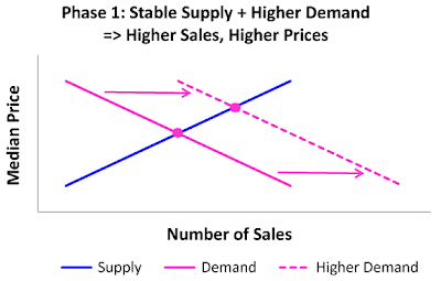 The blue line in the chart (above) represents the supply of housing. At any given price, there is a certain number of owners who are willing to sell. As the price rises, so does the number of willing sellers, hence the upward-sloping line. The purple line represents the demand for housing. As the price rises, the number of willing (and able) buyers drops off, so the demand curve slopes down. Equilibrium is attained at the intersection of the two lines, where supply and demand are equal.
Lending standards were relaxed steadily during the housing boom. This led (for a time) to rising demand for housing. As a result of the relaxed lending standards, there were more buyers who were willing to pay any given price. This is represented in the chart by the dashed demand curve, which sits to the right of the original demand curve. With stable supply and increased demand, prices and sales volumes both increased. This is indicated in the chart by the fact that the new equilibrium is above and to the right of the original equilibrium point.
This roughly describes what happened between 2001 and 2004 (i.e., 'Phase 1' in this story). As prices continued to rise, however, sellers caught on and started limiting the supply of homes for sale. In the second chart (above), the relative position of the dashed blue line indicates that sellers are now demanding higher prices for their homes. In economics parlance, housing supply has gotten tighter. (That characterization will be easier to understand if you notice that the new supply curve is not only above, but to the left of the original supply curve, indicating that there are fewer willing sellers at any given price.)
Combined with stable demand, the net effect of tighter supply is to move the intersection of the supply and demand curves up and to the left of the original equilibrium. In other words, prices rose while sales declined. That's roughly what happened between 2004 and 2005 (i.e., Phase 2 in this story).
The penultimate act of this little cartoon is represented in the chart, below, which shows the effect of shrinking demand combined with tighter supply. The relative position of the dashed purple line indicates that there are fewer buyers who are willing to buy at any given price. Similarly, the relative position of the dashed blue line indicates that there are fewer owners who are willing to sell at any given price. The net effect, in this case, is stable prices and reduced sales volumes. That's more or less what happened in San Francisco between 2005 and 2008, during the final years of the bubble.
 There may be other ways to explain what happened to the San Francsico housing market over the last decade. But this story is simple, and it fits the facts nicely. It strongly suggests that the San Francisco housing bubble began deflating in 2005, long before prices showed any signs of softening. We didn't need the benefit of hindsight to figure this out.
No comments:
Post a Comment