Friday, April 10, 2009

Credit Spread Model Predicts Massive Job Losses

I find a lot of interesting ideas in the Wall Street Journal's "Heard on the Street" column, which is published daily on the back of the Money & Investing section. Today's lead article, Giving Corporate Credit Its Due, describes an economic model from a forthcoming research article by Simon Gilchrist, Vladimir Yankov, and Egon Zakrajsek. The model uses corporate credit spreads to forecast job market activity. Take a look at the chart, below, which compares nationwide hiring activity with the results of the authors' model.

The shaded green line shows the year-over-year percentage change in nonfarm payrolls. The blue line shows the corresponding prediction from the authors' model. Evidently, the model fits the historical data rather well.

There's a big difference between explaining the past and predicting the future. In other words, there's no guarantee that the model's predictions will be accurate. So much for the disclaimers. The current prediction is bleak. It calls for nonfarm payrolls to fall by 7.5% during calendar year 2009. Even if you assume that some of those job losses have already turned up in the official statistics, that would still take the unemployment rate well into double digits by the end of the year.

Reflecting on one of my earlier blog postings about jobs and home prices, this new model suggests that home prices will remain soft at least through the end of the year.

(By the way, a 'credit spread' is the difference between two interest rates, i.e., the rate that a corporate borrower pays and the rate that the government pays. Government debt is assumed to be free of default risk, while corporate debt exposes the holder to the possibility of not being repaid. The difference between the two interest rates encapsulates the bond market's estimation of the likelihood that the corporate borrower will default.)

Tuesday, April 7, 2009

Benchmarking the Financial Crisis - Part 2

In December of last year, Carmen Reinhart and Kenneth Rogoff published an article comparing the current financial crisis to historical financial crises from around the world. I summarized their findings in a previous blog entry. Yesterday, Barry Eichengreen and Kevin O'Rourke published a similar article comparing the current crisis to the Great Depression. Such comparisons have become commonplace. They've generally found that the current crisis has been mild compared to the Great Depression...in the United States. Eichengreen and O'Rourke depart from the usual analysis by comparing the two crises at a global level. Their findings are sobering.

Using the peak in global industrial production (i.e., April 2008) as a starting point, Eichengreen and O'Rourke found that:
  • Global industrial production has fallen by over 10%. Thus far, it has more or less followed the same trajectory as in the Great Depression.
  • Global stock prices have fallen by 50%. In contrast, stock prices had fallen by only about 10% in the first twelve months following the 1929 peak in industrial production.
  • Global trade has fallen by over 15%. Again, the rate of contraction is much greater than in the first twelve months of the Great Depression, when trade fell by only about 5%.

The authors point out that global policy responses have thus far been much more aggressive (and appropriate) than in the Great Depression. Evidently policy makers have learned from past mistakes. Let's hope that we get better results than the last time.

Friday, March 27, 2009

Bay Area Home Prices Back in Fair Territory

Bay Area home prices have fallen more than 40% from their peak. Judging from the heavy demand for bank-owned homes, many investors seem to think that prices have bottomed out. There may in fact be good deals available in the foreclosure market, but recent price trends are not encouraging for the broader market. What do the fundamentals have to say about the issue?

One way to assess the value of an asset is to compare it to the cash flows that it generates. Homes generate rents, so many analysts focus on the ratio of home prices to rents.

(In the past, I've compared home prices to incomes. I've also pointed out that rising incomes lead to rising rents, so the two series typically move in tandem with each other. Comparing prices to incomes is therefore equivalent to comparing prices to rents. Indices of historical rents are easier to find, which is why so many people use them.)

The Case Shiller indices are widely used measures of home prices. Their main strength is that they are based on repeat sales of the same homes, and thus are not distorted by unusually heavy activity in low-end neighborhoods. Unfortunately, these indices don't cover the period before 1987, so I combined them with price indices from OFHEO in order to cover the pre-1987 period. That shouldn't invalidate the present analysis, because we're mainly interested in the post-1987 period anyway. (The two indices were in close agreement until around 2003.)

As for rents, the most readily available measures are the Owner's Equivalent Rent of Primary Residence indices, which are provided by the Bureau of Labor Statistics.

Take a look at the chart, below, which shows Bay Area home prices, rents, and median household incomes for the period since 1983 (when the BLS rent series began).

The solid blue line shows the Case Shiller home price index (with the pre-1987 period represented by the OFHEO index). The dashed blue line shows the BLS rent index. The purple diamonds show an index of median household income, assembled from data provided by the Census Bureau. (The absolute levels of the price and rent indices are meaningless, so I re-based every index to have a value of 1.0 in 1999.)

It's risky to make sweeping assertions on the basis of aggregate statistics, especially when the statistics are compiled from multiple, unrelated sources. But based on this snapshot, I'd say that Bay Area home prices are back in fair territory.

Note: I don't have long-term historical price or rent data for the City of San Francisco, so it's harder to do the same kind of valuation analysis for the City. I'll tackle this in a future blog entry.

Update: The most recent figures from Case Shiller are for December. I should have mentioned that I brought them forward to the end of February using numbers from Dataquick. That approximation is probably no more brutal than any of the other approximations that go into this kind of analysis. (Case Shiller will release its figures for January on Tuesday, March 31st.)

Wednesday, March 25, 2009

How Significant is Fed's Plan to Support Mortgage Market?

The Fed announced a plan last week to buy another $750 billion of mortgage-backed securities, as well as another $100 billion of bonds issued by mortgage giants Fannie Mae and Freddie Mac. Combined with earlier purchases, the new plan will bring the Fed's total purchases of mortgages and agency debt to $1.45 trillion in 2009.

That sounds like a big number, but everyone knows that the mortgage market is huge. How significant is $1.45 trillion?

The Mortgage Bankers Association announced yesterday that it expects mortgage originations to total $2.78 trillion in 2009. That means that the Fed will be providing more than half of the capital used to create new mortgages or to refinance existing mortgages this year.

Without the Fed's intervention, the housing market would be in much, much deeper trouble.

Wednesday, March 18, 2009

Fed Will Pump Another $1 Trillion into Mortgage Market

The Federal Reserve announced plans today to pump another $1 trillion into the mortgage market. That came as a surprise, but lenders reacted quickly by reducing rates on conforming loans to as low as 4.75%. That's still higher than it should be. The current yield on 10-year Treasurys is roughly 2.6%, suggesting that rates on 30-year mortgages should be below 4.5%. We may still get there. The market hasn't had much time yet to digest the Fed's announcement.

Thursday, March 12, 2009

Too Soon to Call an Upturn for San Francisco Housing

There has been some buzz recently about a possible upturn in the San Francisco real estate market. Last night, KPIX ran a story featuring a house that received 42 offers. Hank Plante (the KPIX reporter) is a friend of mine, so I hope he won't take offense if I respond to the story.

During the first two months of 2009, a total of 319 houses, condos, and TIC's were sold in San Francisco. That's 40% lower than the total for the first two months of 2008. Clearly, the housing market has slowed dramatically. But it hasn't ground to a halt.

Who's buying? Considering the state of the credit markets, the current crop of buyers is likely to have unusually strong financial resources. On the other side of the coin, the supply of for-sale housing has been tightening for years, so those strong buyers are competing for a relatively small number of homes. We shouldn't be surprised, therefore, to see enthusiastic bidding for good deals.

This deal appears to have been a good one indeed. The house in question, 555 Edinburgh, was listed at $459,000. The median sale price among the 16 comparable houses that I identified was almost $100,000 higher, at $555,000. Only one of the comparable houses sold for less than $459,000, and that house did not have parking. (In case you're curious, the comparables are all 2-3 bedroom, 1,000-1,500 square-foot houses, located within 1/2 mile of 555 Edinburgh. All of them have been sold since October 1st of last year.)

A $96,000 discount on a half-million dollar house will bring buyers out in force, especially when we're talking about strong buyers competing in a tight housing market.

I want to keep this blog focused on real estate and economics, but this particular situation calls for photographical evidence. Here are two photos of 555 Edinburgh:


...and here are two photos of 350 Edinburgh (one of the comparable houses), which sold for $486,000 on November 5, 2008:


If even one buyer was willing to pay $486,000 for 350 Edinburgh, we shouldn't be surprised when 42 buyers turn up for a chance to buy 555 Edinburgh for only $459,000.

One last comment: If you're thinking that strong bidding for 'good deals' is a sign that the housing market is about to turn around, keep in mind that sales volumes in the East Bay have nearly doubled in the last year, driven by sales of heavily discounted bank-owned homes. The people who bought those homes may indeed have gotten good deals, but that hasn't helped the rest of the market. Median prices in the East Bay have fallen steadily over the last year, and are now down by at least 30% in every East Bay county.

Thursday, March 5, 2009

San Francisco Housing Bubble Has Been Deflating Since 2005

Computer prices have been falling for decades, but that's not because demand is falling. Computer manufacturing technology has gotten better year after year, enabling computer companies to produce cheaper (and better) computers, even in the face of rapidly increasing demand.

What does this have to do with real estate? San Francisco housing prices increased rapidly between 2001 and 2005. Most people attribute these price increases to rising demand. As the example above makes clear, however, rising demand alone is not sufficient to drive up prices. If you want to sell your home at a higher price, you need other sellers to cooperate by limiting the supply of comparable homes. In fact, with enough cooperation, you can get a higher price for your home, even in the face of falling demand. This seems to be what happened during the final years of the bubble.

Take a look at the chart, below, which shows the recent history of sales volumes and median prices for San Francisco housing.

The blue bars (left-hand axis) represent annual sales volumes, and the purple line (right-hand axis) represents median sale prices. The entries for 2009 are year-to-date figures, through the end of February.

Sales volumes peaked in 2004 and have been falling ever since. In contrast, median prices continued to rise until 2005, and then remained stable for the next three years, even as sales declined by over 35%. It's hard to imagine how this sequence of events could have occurred without a sustained contraction in demand beginning in 2005. The following series of charts should illustrate the point.

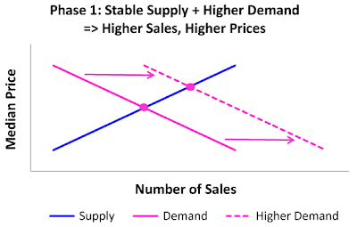
The blue line in the chart (above) represents the supply of housing. At any given price, there is a certain number of owners who are willing to sell. As the price rises, so does the number of willing sellers, hence the upward-sloping line. The purple line represents the demand for housing. As the price rises, the number of willing (and able) buyers drops off, so the demand curve slopes down. Equilibrium is attained at the intersection of the two lines, where supply and demand are equal.

Lending standards were relaxed steadily during the housing boom. This led (for a time) to rising demand for housing. As a result of the relaxed lending standards, there were more buyers who were willing to pay any given price. This is represented in the chart by the dashed demand curve, which sits to the right of the original demand curve. With stable supply and increased demand, prices and sales volumes both increased. This is indicated in the chart by the fact that the new equilibrium is above and to the right of the original equilibrium point.

This roughly describes what happened between 2001 and 2004 (i.e., 'Phase 1' in this story). As prices continued to rise, however, sellers caught on and started limiting the supply of homes for sale.

In the second chart (above), the relative position of the dashed blue line indicates that sellers are now demanding higher prices for their homes. In economics parlance, housing supply has gotten tighter. (That characterization will be easier to understand if you notice that the new supply curve is not only above, but to the left of the original supply curve, indicating that there are fewer willing sellers at any given price.)

Combined with stable demand, the net effect of tighter supply is to move the intersection of the supply and demand curves up and to the left of the original equilibrium. In other words, prices rose while sales declined. That's roughly what happened between 2004 and 2005 (i.e., Phase 2 in this story).

The penultimate act of this little cartoon is represented in the chart, below, which shows the effect of shrinking demand combined with tighter supply. The relative position of the dashed purple line indicates that there are fewer buyers who are willing to buy at any given price. Similarly, the relative position of the dashed blue line indicates that there are fewer owners who are willing to sell at any given price. The net effect, in this case, is stable prices and reduced sales volumes. That's more or less what happened in San Francisco between 2005 and 2008, during the final years of the bubble.

There may be other ways to explain what happened to the San Francsico housing market over the last decade. But this story is simple, and it fits the facts nicely. It strongly suggests that the San Francisco housing bubble began deflating in 2005, long before prices showed any signs of softening. We didn't need the benefit of hindsight to figure this out.