One way to assess the value of an asset is to compare it to the cash flows that it generates. Homes generate rents, so many analysts focus on the ratio of home prices to rents.
(In the past, I've compared home prices to incomes. I've also pointed out that rising incomes lead to rising rents, so the two series typically move in tandem with each other. Comparing prices to incomes is therefore equivalent to comparing prices to rents. Indices of historical rents are easier to find, which is why so many people use them.)
The Case Shiller indices are widely used measures of home prices. Their main strength is that they are based on repeat sales of the same homes, and thus are not distorted by unusually heavy activity in low-end neighborhoods. Unfortunately, these indices don't cover the period before 1987, so I combined them with price indices from OFHEO in order to cover the pre-1987 period. That shouldn't invalidate the present analysis, because we're mainly interested in the post-1987 period anyway. (The two indices were in close agreement until around 2003.)
As for rents, the most readily available measures are the Owner's Equivalent Rent of Primary Residence indices, which are provided by the Bureau of Labor Statistics.
Take a look at the chart, below, which shows Bay Area home prices, rents, and median household incomes for the period since 1983 (when the BLS rent series began). The solid blue line shows the Case Shiller home price index (with the pre-1987 period represented by the OFHEO index). The dashed blue line shows the BLS rent index. The purple diamonds show an index of median household income, assembled from data provided by the Census Bureau. (The absolute levels of the price and rent indices are meaningless, so I re-based every index to have a value of 1.0 in 1999.)
It's risky to make sweeping assertions on the basis of aggregate statistics, especially when the statistics are compiled from multiple, unrelated sources. But based on this snapshot, I'd say that Bay Area home prices are back in fair territory.
Note: I don't have long-term historical price or rent data for the City of San Francisco, so it's harder to do the same kind of valuation analysis for the City. I'll tackle this in a future blog entry.
Update: The most recent figures from Case Shiller are for December. I should have mentioned that I brought them forward to the end of February using numbers from Dataquick. That approximation is probably no more brutal than any of the other approximations that go into this kind of analysis. (Case Shiller will release its figures for January on Tuesday, March 31st.)


 ...and here are two photos of 350 Edinburgh (one of the comparable houses), which sold for $486,000 on November 5, 2008:
 If even one buyer was willing to pay $486,000 for 350 Edinburgh, we shouldn't be surprised when 42 buyers turn up for a chance to buy 555 Edinburgh for only $459,000.
  The blue bars (left-hand axis) represent annual sales volumes, and the purple line (right-hand axis) represents median sale prices. The entries for 2009 are year-to-date figures, through the end of February.
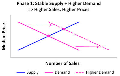 The blue line in the chart (above) represents the supply of housing. At any given price, there is a certain number of owners who are willing to sell. As the price rises, so does the number of willing sellers, hence the upward-sloping line. The purple line represents the demand for housing. As the price rises, the number of willing (and able) buyers drops off, so the demand curve slopes down. Equilibrium is attained at the intersection of the two lines, where supply and demand are equal.
 In the second chart (above), the relative position of the dashed blue line indicates that sellers are now demanding higher prices for their homes. In economics parlance, housing supply has gotten tighter. (That characterization will be easier to understand if you notice that the new supply curve is not only above, but to the left of the original supply curve, indicating that there are fewer willing sellers at any given price.)
 There may be other ways to explain what happened to the San Francsico housing market over the last decade. But this story is simple, and it fits the facts nicely. It strongly suggests that the San Francisco housing bubble began deflating in 2005, long before prices showed any signs of softening. We didn't need the benefit of hindsight to figure this out.
 The blue bars (left-hand scale) indicate sales volumes for the first two months of each year. The purple bars (right-hand scale) indicate sales volumes for the corresponding full-year period. If the historical correlation between these two series holds up, 2009 sales will probably come in around 2,800 units. The lowest previous full-year total was 3,664 units, which occurred in 1995.


